i never stop talking about some of these so i might as well banish them to a single post! you might know about a lot of them already, but feel free to look anyway
freeware can be a great opportunity to get a feel for something and learn a new skill. and in some cases, the free versions are almost as powerful, so you might find that you saved a lot of money but made work that was just about equal to what you might have done with paid software!
Note: I would suggest LibreOffice over OpenOffice, because LibreOffice is still being updated!
i didn’t even realize openoffice was discontinued… now I feel old!! I’ll edit the original post!
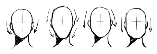
i think an important thing to learn, especially if you start out with drawing anime, is that faces don’t necessarily have to narrow from top to bottom
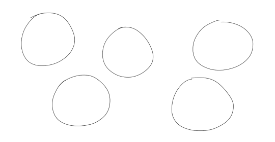
i like to think of wide top, wide middle, wide bottom, and rectangle-like as the 4 main face shapes
what you should keep in mind about them:
you’re only halfway done: the jawlines, the width-length ratio, the amount of fat in the cheeks, the intensity or subtlety of the face’s curves are all important components you still have to decide on after choosing the shape itself
none of these shapes are exclusively feminine or masculine, don’t hesitate drawing them on any gender
most people in real life have some variation of the wide middle type
if you are trying to draw real people, getting the shape of their face down is the first step
i’ve seen tutorials say the shape of the face can tell a lot of the character’s personality – you don’t necessarily have to live by that rule. as long as you aren’t unrealistically drastic about their proportions, their face shape determines their inner qualities as much as it would in real life (not at all)
This is a summary of college only using two pictures; expensive as hell.
That’s my Sociology “book”. In fact what it is is a piece of paper with codes written on it to allow me to access an electronic version of a book. I was told by my professor that I could not buy any other paperback version, or use another code, so I was left with no option other than buying a piece of paper for over $200. Best part about all this is my professor wrote the books; there’s something hilariously sadistic about that. So I pretty much doled out $200 for a current edition of an online textbook that is no different than an older, paperback edition of the same book for $5; yeah, I checked. My mistake for listening to my professor.
Spreading this shit like nutella because goddamn textbooks are so expensive.
not necessarily art related but as someone who couldn’t afford their textbooks this semester this is a godsend
REBLOGGING because after a little digging, I found my $200 textbook for free in PDF form.
friendly reminder that this exists since I know we’re all going back to college soon
Will reblog every time I see it.
For future reference
ALSO, your school library may have it to rent out, if the type of class lends to it you could share with a classmate (+you get a study buddy), or if it’s a minimester you can usually get by with the free trial of the ebook.
always check your options before you buy textbooks!
그리고 영어가 불편하신분들을 위해서 간단하게 작성을 했습니다: “My art was uploaded without permission on Tumblr, and I would like the post removed. This is the original link to my art (소스링크) . This is the post I would like deleted (불펌링크) .”
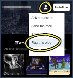
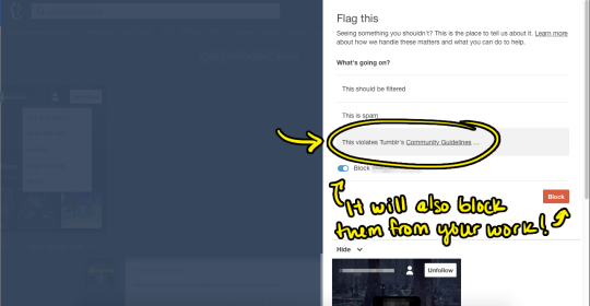
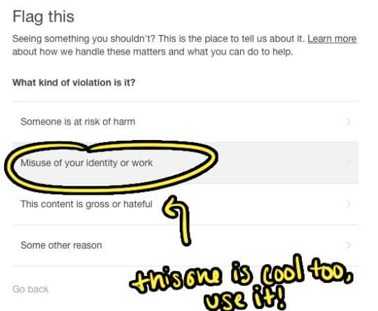
YOU CAN ALSO SEARCH FOR THEIR URL IN THE SEARCH BOX, CLICK ON THE PERSON’S ICON ON THEIR URL BOX THINGY, AND GO TO “FLAG THIS BLOG.”
HERE’S A QUICK STEP-BY-STEP FOR YOU. YOU CAN ONLY DO THIS IF IT IS YOUR WORK!
Its thief huntin season yall
My art aren’t good enough yet to get stolen, but this’ll help other artists who periodically get their work stolen.
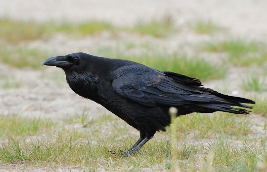
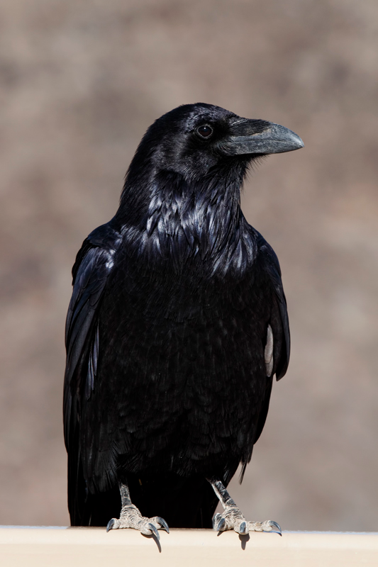
We call the Australian Raven a crow, even if it’s scientifically a Raven we just call it a crow. I’m Australian and I assure you most Aussies will also classify the Aussie Raven as a crow.
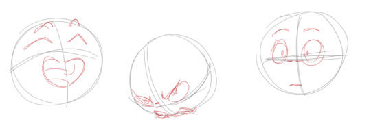
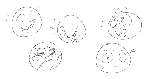
Drawing basic facial expressions is not the hardest. Most people can draw a sad face, a happy face, angry etc., but making more multidimensional expressions is more of a challenge. I have gotten a lot of compliments on how I draw facial expressions, (specifically “angsty ones”) telling me that they are very dramatic and well… expressive! And there are actually only a few things I think about when I draw faces that take them to the next level, so I thought i’d illustrate them all here!
SUPER IMPORTANT TIP BEFORE WE START: Look at your own face when you draw faces. Even making the face when you are drawing (you don’t even have to look at it), will give you some sense of how the face muscles pull and where things fold and stretch, because you can feel it. You are the best reference when it comes to facial expressions!
Angles
Draw the head in an angle that matches the expressions you want to make. It is not a requirement, but is going to add to the effect.
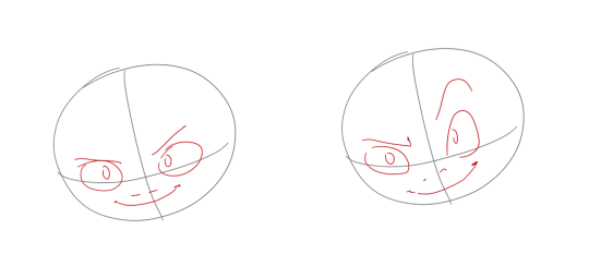
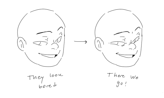
Symmetry vs asymmetry
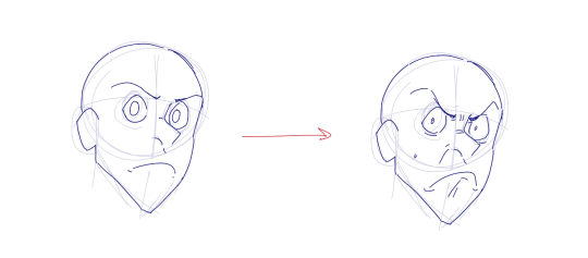
A face is rarely symmetric. Unless the face the character is making is 100 % relaxed or even dissociating, the eyebrows, mouth and facial muscles will have different placements of their respective side. This image shows the dramatic impact asymmetry has on a face:
That’s the difference between a smile and a smirk!
The first one’s like “oh yeah?” and the second is like “oH YEAH??”
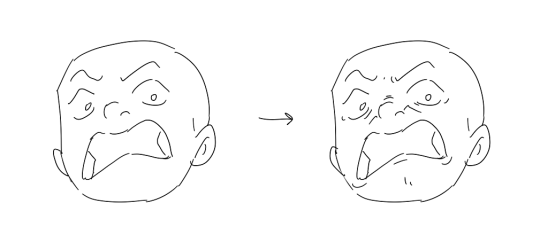
The “balloon squishing principle”
This is something I did subconsciously, and I didn’t know about until I made this tutorial. And this principle goes hand in hand with an asymmetric face. Basically, if you squish one part of the face, you need to even out the empty space by “inflating” the other part of the face so that it doesn’t appear shrunken. The picture hopefully explains it:
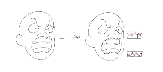
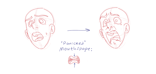
Teeth
Don’t forget to add the gum when the mouth is open to its full potential!
Squinting and folding
Adding folds around the eyes when a character is squinting makes a HUGE difference. It makes a smile more genuine and a growl more intimidating. Adding folds to the face in general makes your characters more lifelike and ‘visually relatable’. Like, they look human, and less plastic or fake.
and so on..
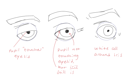
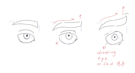
Pupils and irises
The placement of the iris and pupil in relation to the eyelids is very important! The less of the white you see, the more relaxed the character is.
And then of course eyebrows and eyes go hand in hand!
Gestures, spitting, sweating…
Adding more elements than just a face is key to making the character actually look like they are feeling what you want them to feel. Just the tiniest sweat drop adds to their anxiety, spitting adds frustration to their rage, slouching shoulders, waving hands, a double chin, extreme angles, the list goes on! Add whatever and see what kind of impact it makes! Does it do the trick? Great! Add it!
Over exaggeration!!
Remember that you can almost always exaggerate more. Don’t be afraid to do draw “too much” because you’re just experimenting. See what works and what doesn’t. What do you like to exaggerate?
Now that you know some theory, it’s time to practice!
Fill a page with circles and fill them in with different expressions. Try and exaggerate as much as you can!
This is mostly for experimenting. They are quicker to draw than complete faces, but the same rules should apply!
And that’s about it!
I don’t know if I covered everything in this tutorial, since some things might be obvious for me, and this post perhaps only scratches the surface. So feel free to send me a message if you want an explanation about something more in depth! Thank you for reading! And now DRAW!!! ✨🎨
Oh oh my god now Morse code actually makes SENSE when you lay it out like that
Awesome!!
This is also nice, if you want to decode morse code quickly.
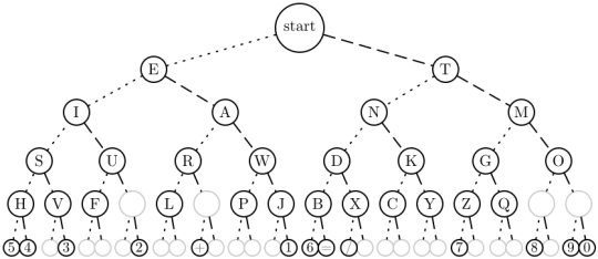
that avl tree though
That’s not a coincidence! Naturally, it’s less work to transmit shorter sequences of dots and dashes, so we try to use up all the shorter sequences first. Basically, this means that we fill in all the branches at one level of this tree before moving onto the next. The result is a perfectly balanced decoding tree.
The placement of the letters is also far from arbitrary. Here are all the letters in English ordered from most common to least common:
ETAOINSRHLDCUMFPGWYBVKXJQZ
Notice something? The shortest morse code sequences were assigned to the most common letters. This makes the common letters easier to remember, and makes messages as short as possible in the average case.
Numbers are sort of an exception to this. All numerical symbols are encoded with 5 dots and dashes. But there’s a pretty clear pattern to these as well.
1 = .—-
2 = ..—
3 = …–
4 = ….-
5 = …..
6 = -….
7 = –…
8 = —..
9 = —-.
0 = —–
So if the listener hears a series of 5 dots and dashes, they immediately know it’s a number. To decode it, they count the number of dashes. If the dashes came before the dots, the number is 5 + the number of dashes. Otherwise, the number is 5 – the number of dashes.


You must be logged in to post a comment.