And they are getting even more strict when it comes to not using invoices for charging for Digital Goods.
Whatever Invoices make you uncomfortable or not, you gotta start using them if you want to keep your PayPal and your money. Changes starting this October 19th.
Honestly I don’t get why so many artists are so overwhelmed by invoices, takes just a few clicks to set up.
And is not only “oh you have to use invoices because PayPal says so” if you don’t use invoices you’re putting yourself at risk of being scammed by an user abusing the buyer’s protection.
Since PayPal ain’t got no idea of what those $50 you received were for, but the buyer is saying they didn’t got anything for the money, PayPal will just side with the buyer.
I’m seriously begging ppl, start using invoices. I’m tired of seeing ppl complain their paypal was banned, or is under investigation, or worse, the $100 they got for a very complicated commission, 3 months later get a refund issue.
just
start
using
invoices
for your own sake.
Here is how you use invoices because I can’t keep playing devil’d advocate, yes I would love to help you get your PayPal restored but just this last month I had to help three persons, and they were MORE than aware of this issues.
Just protect yourself.
Step 1. You login and click here
Step 2. You click create new Invoice. YOU NEVER CLICK REQUEST MONEY, unless you want to risk yourself to get scamer by buyer’s protection exploit and not only lose your money but your paypal account, and any future paypal linked to your irl name.
Step 3 You follow this steps
1. Invoice for amount only
2. Ask your client for their PayPal email and put in that field
3. Add a vague description of what you’re doing, something like “Character Coloured with Background” is good enough, and if you need more than 1 character you can type in “2″ where it says amount, or just say “2 characters”.
Warning: don’t type in “Naruto rawing Sasuke”. That will get you banned.
4. Click send.
Optional steps. Create a template, doesn’t take more than 10 minutes and it will save you a lot of time for future invoices, you can even click on “items” right next to “create invoice” and add a list of services you offer such as “character sketch” “character flats” along with a price, so next time you invoice you just add to the invoice from your list of items and you saved yourself some more time.
More importantly, you protect yourself from buyer’s protection exploit because if PayPal knows you’re doing digital goods, then you will be allowed that you did in fact created a digital good.
Keep PayPal happy, as for right now there are no alternatives to this service, and this is the only source of income for many freelancers.
Stay safe.
Heads up, all commissioning artists
I’ll be doing this from now on!
ADDING THIS BC I HATE PAYPALLLL
OK so when you send/make invoices…it doesnt let you choose ‘digital good’ or differentiate between “goods (as in physical)” and “services” (as in doesnt need address) which is what you could do with micropayments….
SO WHEN U SEND INVOICE the buyer will be asked for their shipping address. ( I even had the options turned off for shipping?? I was pretty sure there USED TO be an option that you turned off and then it wouldn’t ask for shipping, but that doesnt seem to work anymore? I went to where the setting was and still had the boxes unchecked, and yet my buyer was still getting asked to put in shipping address, and when invoice was paid, i was being asked to provide shipping label by X date or Consequences.)
SO APPARENTLY YOU HAVE TO DO THIS as the SELLER
SO go to the invoice (i think this can be done BEFORE the buyer pays?? Didnt try myself tho, i did it after it was paid), and click on VIEW DETAILS in that first box
Scroll to the bottom of the page and click ADD TRACKING INFO
(YES COUNTER-INTUITIVE AS BALLLLLS.)
of course HERE IS WHERE YOU’RE GIVEN INSTRUCTIONS ON PROCESSING DIGITAL GOODS. HIDDEN BEHIND A BUTTON YOU WOULDNT PRESS IF YOU WERE, SAY, TRYING TO SELL DIGITAL GOODS.
Select Order Processed/Service Rendered
YAY this stuff fills itself out and you can save and not have to worry about shipping your Digital Intangible Product to a very confused seller.
I am so salt about this. excuse me while i go cry angrily.
Think I’ll reblog this for my own use…
Guess I gotta get used to sending invoices for all transactions soon then
Hey! Sorry for the late reply, I haven’t really had time to do the tutorial for you! But, I did one today. It’s kinda messy and not 100% anatomically perfect (I do several flaws myself) but I think I made some good points!
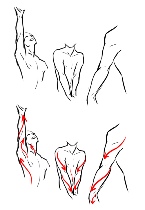
Arms:
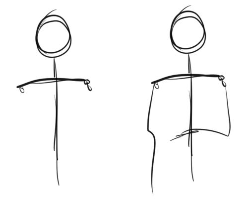
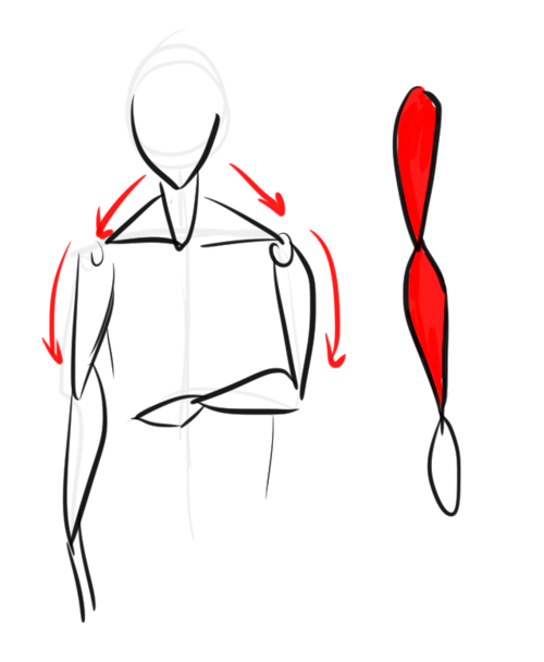
Arms cannot be done without shoulders, so that’s why I will include them here. To know how one body part works, you need to understand the other parts too. I suggest drawing a stick figure, as shown above. Do it with shoulders and everything – don’t care about anatomy. Really, don’t – go mad! You can figure out how to deal with the anatomy AFTER you have figured how to draw the body freely.
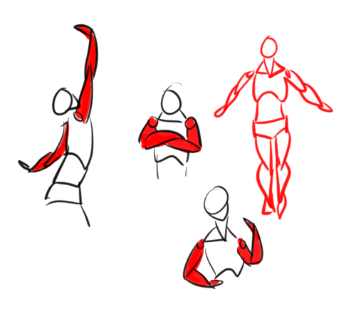
I imagine most body parts to be shaped as tear drops, as shown above; especially the arms and legs. Draw them above the stick figure – don’t be afraid to overlap the teardrops. In fact, I suggest it! The best way to understand anatomy is to think of it as shapes and doll-parts.
After you’ve figured that out, do several, VERY tiny, small doodles like these. Go crazy – don’t bother with anatomy just yet. Do them also very quickly and so small you can’t think of the details. Just keep doing this until you sorta understand how arms work.
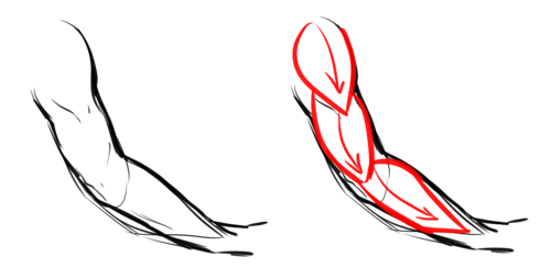
Here is a doodle of a “real” arm, and as you can see, how it’s shaped it resembles the teardrops above. A general rule is to constantly draw the body in curves – male AND female. NEVER draw a single line straight.
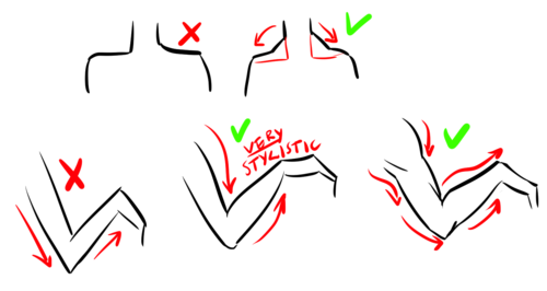
I mentioned before I thought it was important to include shoulders/other body parts to understand another. This is why. The body basically has a “flow” when you move. The red lines clearly shows the flow. This is also how you can create a dynamic pose: think of the flow. The muscles are formed that way to be able to function. Which reminds me, buy some good anatomy books. And I’m talking about more or less MEDICAL anatomy books – you think you won’t need it – but trust me, it’s more useful than you can imagine. I do NOT suggest buying “stylistic” anatomy books, like Christopher Hart (ugh NO), for example, as these can mislead you. Medical anatomy books CANNOT because they MUST be right.
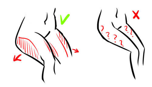
And for the last part, here’s some “do’s” and “don’ts”. It’s important to remember the muscles between the neck and shoulders. Many, especially when drawing females, forget this. It’s true the most visible it is – the more muscular you will look. But even the most petite people have these. Your neck literally would not function if you didn’t have these supporters. Then, the arms below is just to show why it’s important to draw the body with curves. Many have probably heard “straight lines for males” which is a complete lie. They will look stiff and unnatural. Curves can both empathize muscles AND fat. Heck, even your bones aren’t straight.
Legs:
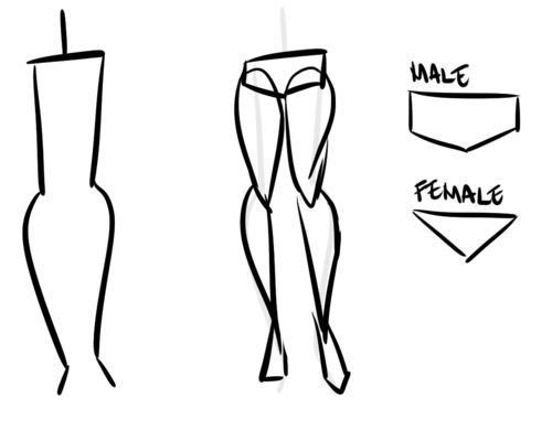
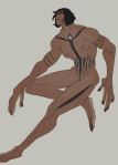
Legs certainly are the hardest. There’s a good reason for this; because they’re one of our most strongest muscles, and they are more or less dominating when it comes to poses (together with the spine). However, just like with the arms, draw a stick figure. I won’t suggest drawing them completely straight, as you can see here, as it will add weight. Do teardrops shapes. As for the hips – think of them as panties or briefs. This is not a MUST; but it will help; I think!
And just like the arms, do small doodles. Don’t be serious, play around until you get the idea.
As you can see, these legs easily can be turned into teardrops even when they’re detailed like this.
Now, what makes legs/hips interesting is that the way fat gathers there. Although not a must, seeing as we’re all different, females tend to get more fat there than men. Usually, however, it’s not at the SIDE of the hips, but at the thighs, calves and the “love handles”. (Excuse my english, aaah…) Women also tend to have bigger hips, but again, it’s not a must. It’s not uncommon to have small hips, either; or big hips for men, etc.
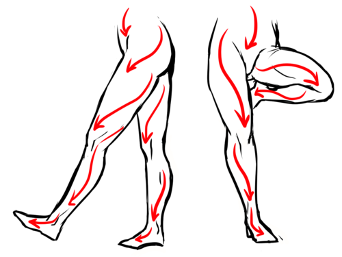
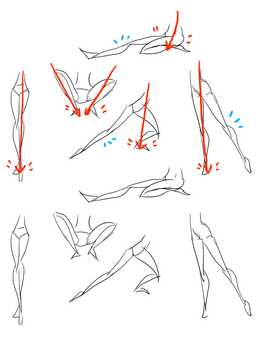
Of course, the legs too follow the “flow”!
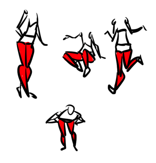
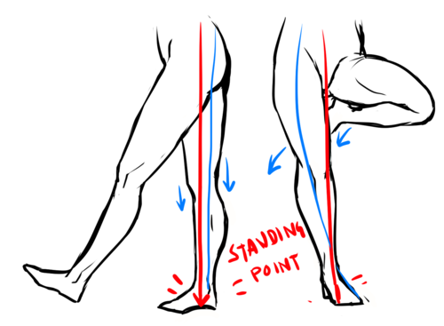
Something worth noting is the “Standing point” The standing point is basically a straight line, and the further away you are from the line; the more unbalanced you are. To create a dynamic pose you should avoid that line as much as possible. However, if you want to look balanced/realistic, have the one leg stand there for support. The leg to the left is balanced, as you can see one of the legs is taking all the weight; with other words, it’s the support leg-making it balanced. The legs to the right, however, are likely to fall over if she keeps standing like that! edit: <- that explanation was horrible. Hope you still get it.
Now for some more do’s and don’ts. I already mentioned the barbie legs, invisible heels and micro-mini crotch in my previous tutorial, but these two are different. I see this mistake a lot; when you sit down, your thighs will become wider because you’re pressing all the fat to the sides. Now, this also depends on how you’re positioning your legs. How much it widens depends on how much fat you have in the first place; but it will always be there.
And then there’s this awkward “thigh gap”. Before I get any haters telling me how I “thin shame”, please, take a seat and read this. Good? Good. How much space you actually have between your thighs depends fully on how you’re standing, bending, angle, body type and everything else. However, the one to the left? Not likely.
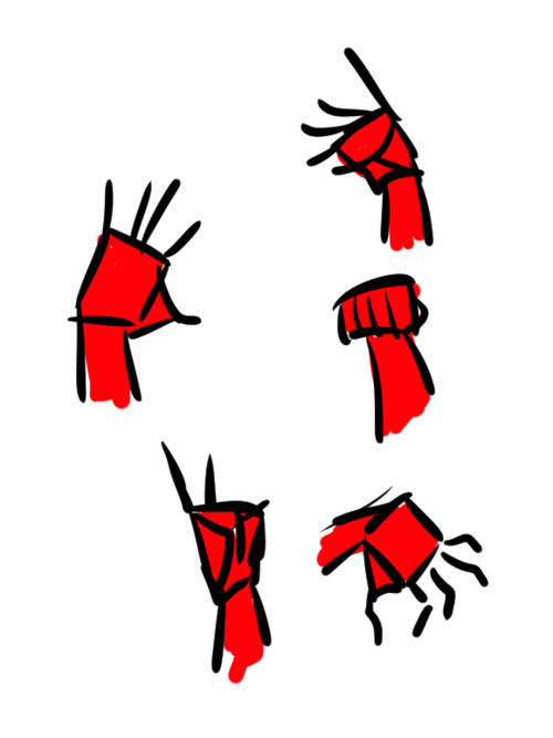
Hands:
– Okay, I’m getting really lazy now; so I’ll be quick. Draw a rectangle. Sorta like this; it doesn’t have to be exactly like this – since hands can be shaped VERY differently. Just compare to your friends.
– Draw a little triangle attached to it.
– Now, the fingers! How long they should be and etc doesn’t really matter either. But if you’re unsure, draw them as tear drops, too.
– Now, flesh out the fingers! Starting to look like a hand, sort of.
– Then draw the details and fix things you didn’t like. I really don’t like the way this is drawn but I’m just tired right now.
Just like the legs/arms, practice by doing that simple figure really quickly.
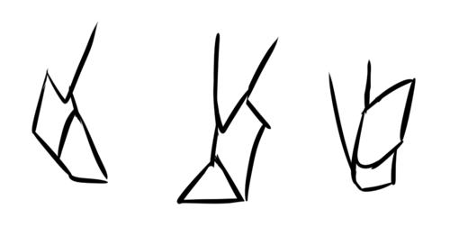
Feet:
Okay, I’m getting really lazy. Plus, feet are SUPER HARD- I’m just going to say this: think of them as triangles. Overlap them; think of it as 3D!
Practice practice practice! And medical anatomy books. And photo references. And real-life references!
Hope this helped! o/ As I said, I’m nowhere near perfect but, ahh, I tried.
Hi!! I’ve absolutely been thinking about that, yeah, in fact I recently talked about that to my boyfriend just recently. It’ll likely happen after october! And to answer your second question! I made a thing on legs that i hope you’ll find useful!!
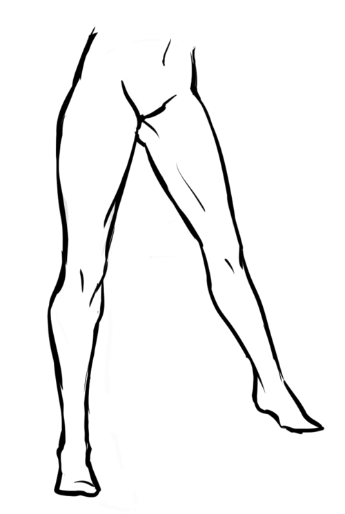
So. I’ve already explained basics on legs here, but I don’t think it hurts to go through some extra details to help you understand legs some more.
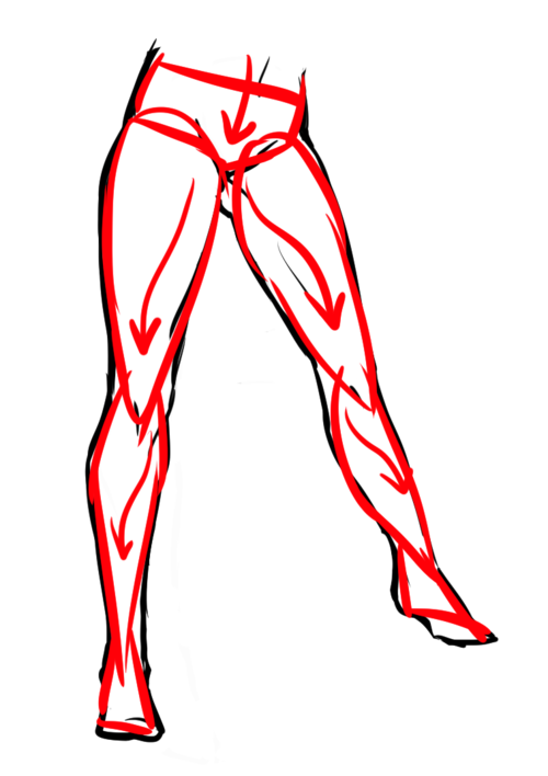
The very basic thing is to imagine legs as teardrops. Again, this has already been covered in said tutorial above, but I figured it’s still good to mention even the most basic thing that I know of. I still highly recommend you check it out to get in more detail and to see some other examples and practices that you do. But basically, think of legs in the shapes of teardrops, when it comes to shape. If you need a simple stick-figure to connect the legs in the first place, make sure that they bend at the knees a bit so that the legs don’t come off as stiff and unnatural.
As you can see, this method works perfectly for realistic legs as it does for stylistic ones. Remember to use these as a guideline, never to be the exact base of the legs you will be drawing. If you draw traditionally, remember not to draw these guides too hard, or they will be hard to erase/do freestyle!
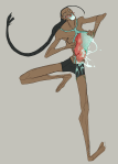
But how do you actually draw out the legs without drawing them perfectly straight, as shown to the left? The trick is to add volume to them, and how you do that can be winged to your own liking. The idea is to think in curves. As no leg is perfectly straight. You may make these curves minimal if you don’t want them to be curvy, but keep in mind, still, that not even your own bones are perfectly straight, so it is highly recommended that you make them bend, at least a little.
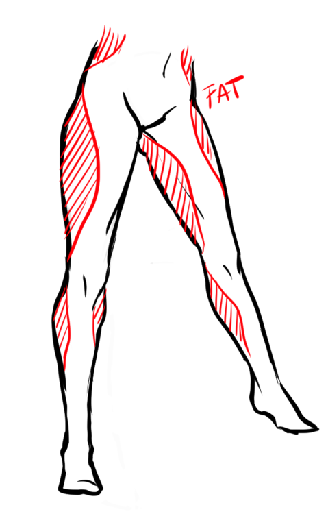
It all depends on how you draw them as well. Say you put your legs together, as shown in this picture, what happens to the fat and muscle? Naturally, they press together, much like how thighs squish on the surface when you sit down (I’m sure most people know what I’m talking about). Make sure this shows in your art! This is very important to keep in mind, because it makes it all look more natural and believable. Try to cross your legs or stand up and sit down again for real-life examples!
The same applies for stretching your legs, more or less, except they appear to become more ‘hollow’ and slimmer. They become less soft to the touch, too, and might show. Try stretching your legs and feel where the muscles tense and where it feels ‘hollow’. This is very helpful with your art.
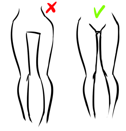
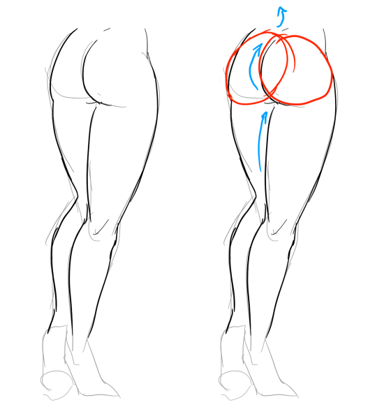
Many leg tutorials talk about legs without mentioning the behind. It requires a tutorial on it’s own, in all honesty, but this is the most simplest way to draw it connecting to the legs. Remember that it comes in many different shapes, and this is just a super basic guide! Two circles overlapping, while following the line and flow of the legs. Remember the muscle/fat as mentioned above!
Okay, so we got the basics of leg shapes figured out? What if you want o draw them in a certain pose, or with a certain silhouette, but perhaps do not have the reference for it? Or you want to blend your style into it? The key is to not shy away from doodling the form. Make mess, draw lightly and don’t care about the anatomy. That way you’ll get everything down without it appearing stiff. You can clean up the sketch later, always, and if you can, use a reference after you have drawn your pose, to correct your drawing.
Remember that the hips do a lot to the pose of the legs! Make sure they are in flow with your legs, so that it can look more natural. Remembers that hips ‘rotate’ with the spine.
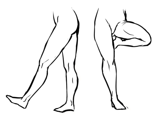
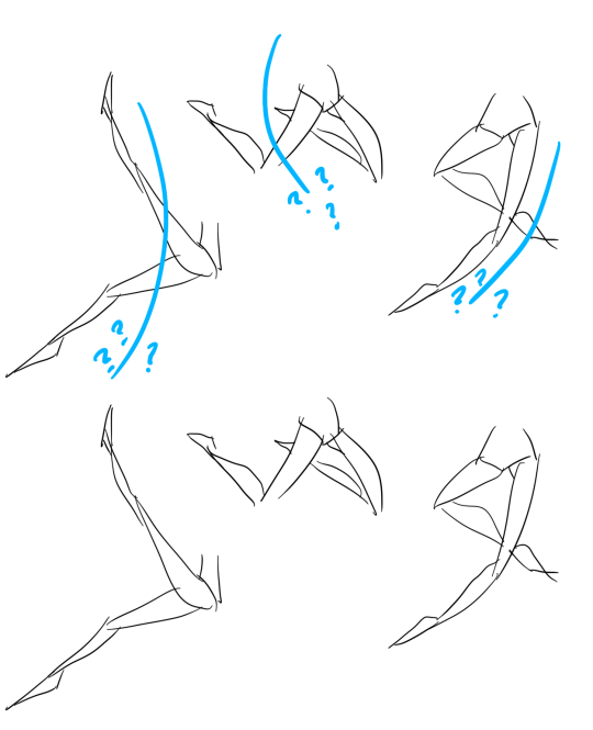
I’ve talked about this method before when it comes to posing, and the same applies for the legs. One way to make legs appear ‘steady’ is to picture them standing in a line, and one of those legs need not to stray from the lines too much, making it steady. If you want a dynamic pose despite the steady pose, you can always have the other leg stray from the line, since it only matters that one leg is steady. This method can create good, casual poses without making them appear boring. (also notice how the teardrop shapes are used here, despite the highly stylized legs)
Do you want a highly dynamic pose, or them to appear unsteady, then skip the line entirely and make both legs aim away from it completely. As you can see, the legs appear more moving, in action, as if they’re fighting, falling, or dancing. As you can imagine, this is not a pose that one could stay steady on, suggesting that it’s taken mid-movement. More about posing and this ‘line’ method is talked about in this tutorial.
Hope this helped you, if you have any questions let me know, and if you’d like to check out all my tutorials they can be found here!
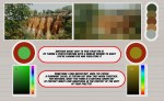
Hey there Anon! Sure thing! I’ll do my best to explain the process of how I usually do things in regards to coloring and shading. I’m not the greatest at Explaining, so I’ll do my best to keep things as crystal clear as possible!
Step 1: Lineart I’ll start with Lineart purely because this step is important to the coloring process in one regard, and that is making sure the entire line layer is closed without any holes. Even the smallest little gap will make the selection process hard later, and we don’t want that. So the cleaner lineart you have, the better. I’m going to go ahead and use my Monster Hunter Generations Huntress for this.
Step 2: Selection Either in Photoshop or SAI or whatever you use, click outside your character and any other negative space surrounding them. This means…basically anything that’s not your character. Then go to Selection > Inverse and invert the selection. You should have something similar to what I have below. This makes it so much easier to add colors without having to worry about all the little nooks and crannies that could mess the cleanliness of the drawing up real bad.
Step 3: Flat Base Create a new layer beneath your line layer with the selection still active. This will be our color layer. Remove the visibility of the line layer, and fill the remaining “Silhouette” with a dark base color. This makes those nasty corners look a bit cleaner, as sometimes if there is a lighter color your computer will want to make them stand out pixelated. Again, this is just for cleanliness beneath the line layer. Turn your line layer back on, as they will now act as barriers for the fill bucket tool. Make sure the entire silhouette is filled, and that no lines were accidentally selected! You want a see a completely filled and flat color if you turn the line layer off.
Step 4: Flat Colors At this point you can lock the transparency of your Color Layer, and go ham. Either with the pen or a fill bucket, figure out how you want to color your character and add in the flat colors. Notice I’m on the same layer as the Base that we made. This is so those lines still play nicely with one another. Clean up where necessary.
Step 5: Analogous Color Gradient Well, we don’t really want our character to be too flat, do we? This is where the color wheel becomes your best friend. Select similar colors with the Magic Wand (like I’ve done her skin tone here) and using the color wheel, choose an analogous (that means “close by” in color wheel terms) color to add a bit of depth to the color. For skin, I usually go with a red or a bronze, sometimes purple. Use the airbrush for this. Then, deselect and select another color to gradient, until all the colors have some degree of new color to them.
See? Now things look interesting! We added some blue to the greens, some purples to the reds, some blues to the grays and so on and so forth.
Step 6: Shading Okay, here’s where things get interesting. Time to shade. Make a new layer between the Line Layer and Color Layer, and make sure you make it a clipping group/clipping mask. This is so it won’t go anywhere that you don’t have color. Set it to multiply or linear burn (whichever you think looks best) and bump the opacity down to about 40-50%. Choose a color that you want the shadows to be; I like deep pinks and purples. I first use the Pen tool to get down “hard” shadows – shadows cast by hard materials, close shadows, and inorganic materials. Once I’ve got those down, I head on over to the softer areas, such as the skin, hair and cloth and alternate between the watercolor and marker tools to give “softer” shadows. There’s no real law to this, you just have to know where shadows fall and how they behave and work with those three tools to get the look you want.
Step 7: “Highlights” – Rim Lighting Okay, these aren’t really “highlights” in the correct sense, but adding sort of “rim lighting” around forms really helps make a picture pop. To do this, make another layer above the shading layer, set it to “screen” and keep the opacity at 100%. Then, get really familiar with your CRTL key because you’re going to be color sourcing a lot. To add a rim light to a form, select the base color of that form, and use the marker to trace along the edges. For example, I picked up the nude from the skin, the silver from the dagger, the gold and maroon from the hair and the tawny brown from the skull to use on those specific objects. Any place you want clean works well, but the edges of forms works best for this technique. Additionally, if you’d like, you can create another layer above the Screen Layer and set it to Linear Dogde, and do my “glowing eyes” technique on anything you want to stand out, such as the metal of the belt, gold objects and of course, eyes.
Step 8: The Overlay Almost done! While your photo can now stand alone as “finished”, there’s one more thing that I enjoy doing, and that’s adding a simple color overlay to bring the whole picture together. This is done by flattening all the layers you have so far (you’ll want to “Merge Down” in order from bottom to top or “Flatten” to avoid the layers going crazy on each other) into one layer. Then, make a layer on top of that one, set it to a clipping mask, and set it to “overlay”. With the Airbrush, choose some colors (I prefer soft pinks, blues and violets) and go along the “edges” of your character with a BIIIIIG brush. This kind of resembles soft ambient lighting or shadows. I just think it makes the photo look nicer.
TA-DA! And Now we’re done!
And there we go! I hope that helped, and I also apologize cause this ask sat in my box for awhile and I never got around to it until now. 😛 I’d be happy to answer any questions y’all have, but this is the simple basics! Remember to practice practice PRACTICE! -Gael
Hey friends! Meg here for a really, long, wordy TUTOR TUESDAY! This week we take a look at drawing characters that are interacting. If you need help with anatomy here are a few tutorials: legs, arms/legs, necks, and here is a previous tutorial on poses. If you have any tutorial suggestions send ‘em in here or my personal. Now go forth and I’ll see you next week!
By no means am I a teacher these are tips on how I personally draw stuff. That being said I will be uploading much more in detail tutorials about anatomy and background/scenery construction on my Patreon exclusively in the future as these were just 20 minute quick cheat sheets so to speak.
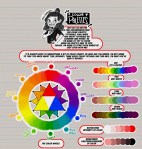
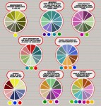
Meg here for TUTOR TUESDAY! Just a quick beginning look at colors and some color theory! I’ve had a few recommendation for color palette stuff, so I hope this is a start! Paul has done some on color as well! If you have any recommendations send ‘em in here or my personal! Keep practicing, have fun, and I’ll see you next week!
This was a request and at first I wasn’t sure if I had anything to provide with, but as it turn out it got a little longer than I expected because there were actually things I had to say!! Wow!!
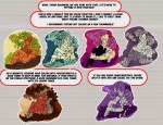
Anyway, this is some guidelines I follow when I try to make the face expressfull, more specifically the mouth! It is often neglected, since it’s actually pretty hard, I’ll admit. But I’m here to help (hopefully…)! A mouth expression tutorial as per request. Enjoy and hopefully it will help some a little. ʕ•ᴥ•ʔ
Draw the teeth at the right angle.
This is super important. The upper jaw follows the angle of the head, and the lower jaw will depend on how open it is. Make sure you have a rough estimate of where the teeth are, and how much of them you’re going to see!
The lips will VERY roughly follow the same angle as the teeth. It really depends on the character, but it gives you a sense at least.
If you DON’T do this, you’re going to lose so much volume and the mouth is going to end up looking unrelatable. I showed this example in this tutorial:
It’s not just the lips!
The cheeks, chin, and tongue play a role too!
Try look at your own mouth or references! I have a very pliable and large mouth, so that’s one reason why my characters have it too lmao.
ASYMMETRYYYYY (ง ͠° ͟ل͜ ͡°)ง
I cannot emphasize how important asymmetry is when drawing expressions. It applies not only to the eyebrows to achieve the Dreamwork Face™, but also the mouth. Seriously if you draw a symmetric mouth I will deliver myself to your mailbox and then shout at you until you fix it.
Look at the difference between these two for example: which one has more “life”?
I think you get the idea.
Push and squish – give it flow
Here’s an old drawing I have but it illustrates how I think when I squish the mouth, and use folding and wrinkles to my advantage.
Look at your own face and see where skin bundles up, where it creases the most and when bumps appear on your chin. Subtle details makes all the difference!
One VERY effective detail is illustrated in the first sketch, where I pull upwards on one side, and downwards on the other. That’s a good detail to use when the character is making a skewed expression, or is extremely frustrated. I encourage you to play around with that concept bc it’s ~super effective~!
EXAMPLES:
Happy: Your entire mouth is pushed upwards, not just the corners of your mouth!
I tend to draw a :3 mouth bc I’ve been drawing Lance too much….. You don’t have to but it’s basically imprinted in my motor memory by now.
Pouting/frowning: corners are pushed down, middle pushed slightly up. Sometimes, there’s a slight dip in the middle too. It can give a sense that the character is biting their lips.
Showing frustration/intimidating/is intimidated: basically showing a lot of teeth. The corners are as open as possible and the middle sorta more squished. An extremely important detail here is showing some of the gums, and open space between the cheeks and teeth. That way it looks like the mouth it open to it’s full potential. Here is also where you basically MUST add folds and bumps, or else it’s not going to look relatable.
(Here I am again with the pulling upwards on one side and downwards on the other, as illustrated on the last sketch)
And then again, here’s just another doodle showing how important it is to show the gums. It’s the same face twice, but the second one looks slightly more frustrated doesn’t it?
As you can see, this last one is very versatile and I draw it a lot. Play around with the basic shape and see how much subtle details makes a lot of difference!
That’s it!
I hope that cleared some things up and was somewhat helpful! Enjoy drawing ✨


You must be logged in to post a comment.