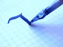
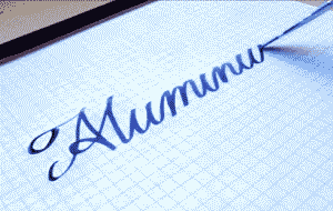
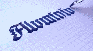
ARE YOU FUCKIN SERIOUS I’VE SPENT SHIT TONS OF MONEY ON CALLIGRAPHY PENS FOR ART AND YOU’RE TELLING ME I CAN MAKE MY OWN FOR LESS THAN 4 FRIGGEN DOLLARS??? THIS IS BULLSHIT MY ENTIRE ART LIFE IS A LIE
Okay! I’m going to try to answer this best I can, but before I do, please remember I am just a humble animation student and by no means a professional artist or a seasoned expert, so this might not be the correct way to do things or be extremely accurate. This is just how I do it, and a couple tips I’ve picked up from teachers at school.
First of all, getting familiar with the anatomy of legs helps a lot! (I know this is the dreaded answer to every art question) I don’t know too much about the muscles of the legs other than the basics, so I don’t talk about them here because I don’t want to look like an idiot. They’re very worth studying though, especially the muscles that form the inside of the thigh and back of the calf.
Those are some leg studies I did from life in class last year, with the key parts labelled.
Chances are you’ve tried to draw legs and??
Unless you’re going for a certain style, legs that look like straight tubes or 90 degree angles are gonna look a bit weird.
As you can see with the life drawings above, legs have certain natural curves and rhythms to them! None of the bones in the legs are straight or tubular, so your legs should not be either.
Sorry for the really mediocre pelvis it’s not my strong suit oh god. It’s easy to characterize the legs as something like this:
Remembering that the knee is a hinge joint and that it has a sort of curved offset from the upper leg to the lower leg really helps.
So when you keep that offset in mind and apply some curves over the muscle and fat layered on top of those BEAUTIFULLY RHYTHMIC bones, you get dynamic flow in your legs. The hip (trochanter), kneecap (patella) and ankle (fibula/tibia malleolus) are good landmarks to keep in mind.
So by applying some curves, you get a softer/more dynamic/rhythmic feel to the legs that makes your figure look a lot less static even if they are standing entirely still. It’s also worth noting most people shift their weight onto one hip or another, position their feet weirdly, etc etc.
If you’re an artist who likes to work really close, (like me), do yourself a favor and put up two views. You can do this by clicking View–> New on your toolbar.
There’s nothing worse than finally zooming out and realizing what you were doing was very wrong. This saved me a lot of grief tbh. I’m sure everyone knows this already but ._.;; I arrived quite late to that party.
Last night, Paul Mendoza and I spoke to our animation class about the concept of “Simple vs Complex,” and I thought some of you might find this useful. The idea is to balance a strong pose by contrasting simple and contrast forms. The simple (stretching) side of a pose is usually your main line of action, while the complex (squashing) side is where you get most of the interest and the focal points of the pose. “Simple vs Complex” also works for individual parts like a flexing arm or a hand pose. This concept enhances clarity, appeal, and energy in any pose.
Bruce Timm’s style illustrates this concept best, but great actors (like the Python troupe) display this kind of posing all the time.
… AND THAT IS THE WAY I MAKE FIRE! Simple and messy “how to gry”. I will add quick smoke tutorial / step by step too Just wait. o/
EDIT: Sorry for small images >8C I am not good with tumblr image sizes and I have never understood them. But by copying the image URL you can see bigger sized images!


You must be logged in to post a comment.